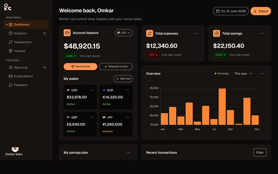
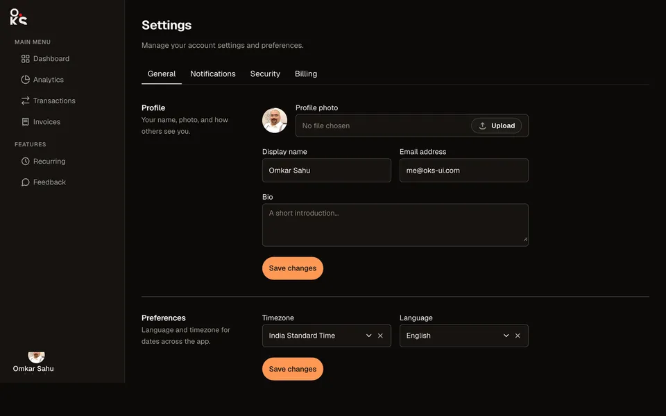
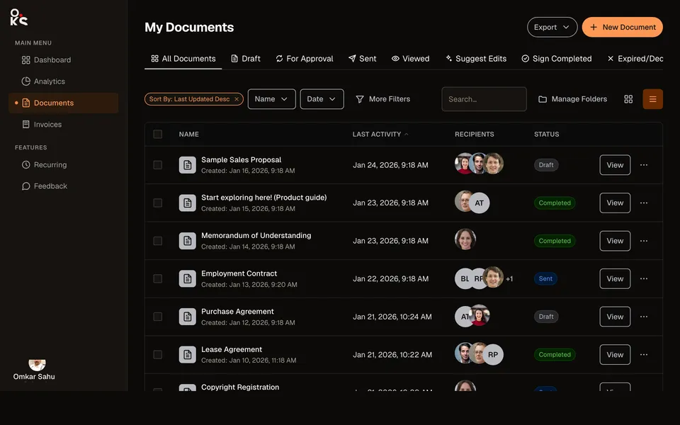
 oks-ui
Team members table
The team-settings list: a checkbox-selectable Table whose cells render an Avatar + name/email, a status Chip, and a group Chip, plus a per-row Dropdown of actions, a rows-per-page Select, and a real Pagination control.
Built with
- TableComponent
- AvatarComponent
- ChipComponent
- DropdownComponent
- Select FieldComponent
- PaginationComponent
- NavComponent
- ButtonComponent
- Page TitleComponent
How it’s built
- 01
selectionMode="multiple"on Table gives the header/row checkboxes andselectedKeysstate for free. - 02Two Chip colors do double duty —
statusToneandgroupToneboth map a raw string to a real Chipcolor, so adding a new status or group is a one-line change. - 03The numbered page buttons are hidden via
classNames={{ page: "hidden", ellipsis: "hidden" }}, leaving Pagination's real prev/next arrows as the only controls — a supported customization, not a different component.
Source
Three files · copy & pasteStyling: this source uses Tailwind utility classes and this site’s colour tokens (for example text-ink, bg-paper and border-line). The oks-ui components render without them; swap those classes for your own.
"use client";

import { useMemo, useState } from "react";
import { Avatar } from "oks-ui/avatar";
import { Button } from "oks-ui/button";
import { Chip } from "oks-ui/chip";
import { Dropdown, DropdownItem, DropdownMenu, DropdownTrigger } from "oks-ui/dropdown";
import { FormFieldSet } from "oks-ui/form-field-set";
import type { NavItemData } from "oks-ui/nav";
import { PageTitle } from "oks-ui/page-title";
import { Pagination, PaginationSummary } from "oks-ui/pagination";
import { Table } from "oks-ui/table";
import "oks-ui/avatar.css";
import "oks-ui/button.css";
import "oks-ui/chip.css";
import "oks-ui/dropdown.css";
import "oks-ui/form-field-set.css";
import "oks-ui/page-title.css";
import "oks-ui/pagination.css";
import "oks-ui/table.css";
import { AppShell } from "./AppShell";
import {
  BriefcaseIcon,
  CreditCardIcon,
  DownloadIcon,
  GridIcon,
  MoreIcon,
  PlusIcon,
  SettingsIcon,
  UsersIcon,
} from "./icons";

const NAV_ITEMS: NavItemData[] = [
  {
    key: "main",
    label: "Main menu",
    isSection: true,
    children: [
      { key: "dashboard", label: "Dashboard", icon: <GridIcon size={18} /> },
      { key: "team", label: "Team members", icon: <UsersIcon size={18} /> },
      { key: "billing", label: "Billing", icon: <CreditCardIcon size={18} /> },
      { key: "projects", label: "Projects", icon: <BriefcaseIcon size={18} /> },
    ],
  },
  {
    key: "other",
    label: "Other",
    isSection: true,
    children: [{ key: "settings", label: "Settings", icon: <SettingsIcon size={18} /> }],
  },
];

type Status = "Active" | "Inactive";
type Group = "Design" | "Development" | "Marketing";

type Member = {
  id: number;
  name: string;
  email: string;
  status: Status;
  location: string;
  phone: string;
  group: Group;
} & Record<string, unknown>;

// A handful of rows get a real photo — two are the same stock-free portrait
// assets used elsewhere on this site, three are AI-synthesized
// (non-real-person) faces — the rest fall back to initials.
const PHOTOS: Record<string, string> = {
  "Tom Cooper": "/hero/person-man.jpg",
  "Leslie Lawson": "/hero/person-woman.jpg",
  "Annette Black": "/avatars/synthetic-1.jpg",
  "Floyd Miles": "/avatars/synthetic-2.jpg",
  "Theresa Web": "/avatars/synthetic-3.jpg",
};

const MEMBERS: Member[] = [
  { id: 1, name: "Tom Cooper", email: "cooper@gmail.com", status: "Active", location: "United States", phone: "+65 9308 4744", group: "Design" },
  { id: 2, name: "Leslie Lawson", email: "lawson@gmail.com", status: "Active", location: "Canada", phone: "+65 8689 9346", group: "Development" },
  { id: 3, name: "Kristin Watson", email: "watson@gmail.com", status: "Inactive", location: "Germany", phone: "+62-896-5554-32", group: "Marketing" },
  { id: 4, name: "Annette Black", email: "a.black@gmail.com", status: "Active", location: "United States", phone: "+62-838-5558-34", group: "Design" },
  { id: 5, name: "Floyd Miles", email: "miles@gmail.com", status: "Inactive", location: "United States", phone: "+1-555-8701-158", group: "Development" },
  { id: 6, name: "Cody Fisher", email: "fisher@gmail.com", status: "Inactive", location: "United States", phone: "+61480013910", group: "Design" },
  { id: 7, name: "Theresa Web", email: "theresa@gmail.com", status: "Active", location: "France", phone: "+91 9163337392", group: "Development" },
  { id: 8, name: "Tim Simmons", email: "simmons@gmail.com", status: "Active", location: "United States", phone: "+49 1590 12345678", group: "Marketing" },
  { id: 9, name: "Jenny Wilson", email: "j.wilson@gmail.com", status: "Active", location: "Australia", phone: "+61 412 345 678", group: "Development" },
  { id: 10, name: "Robert Fox", email: "fox@gmail.com", status: "Inactive", location: "United Kingdom", phone: "+44 7911 123456", group: "Marketing" },
  { id: 11, name: "Savannah Nguyen", email: "nguyen@gmail.com", status: "Active", location: "United States", phone: "+1-555-0192", group: "Design" },
  { id: 12, name: "Darrell Steward", email: "steward@gmail.com", status: "Active", location: "Canada", phone: "+1-647-555-0142", group: "Development" },
  { id: 13, name: "Courtney Henry", email: "henry@gmail.com", status: "Inactive", location: "Germany", phone: "+49 30 1234567", group: "Marketing" },
  { id: 14, name: "Wade Warren", email: "warren@gmail.com", status: "Active", location: "United States", phone: "+1-555-0148", group: "Design" },
  { id: 15, name: "Esther Howard", email: "howard@gmail.com", status: "Active", location: "France", phone: "+33 6 12 34 56 78", group: "Development" },
  { id: 16, name: "Jacob Jones", email: "jones@gmail.com", status: "Inactive", location: "United States", phone: "+1-555-0177", group: "Marketing" },
];

const statusTone: Record<Status, "success" | "default"> = { Active: "success", Inactive: "default" };
const groupTone: Record<Group, "info" | "success" | "secondary"> = {
  Design: "info",
  Development: "success",
  Marketing: "secondary",
};

const PAGE_SIZE_OPTIONS = [
  { label: "8", value: "8" },
  { label: "10", value: "10" },
  { label: "20", value: "20" },
];

const RowMenu = ({ label }: { label: string }) => {
  return (
    <Dropdown placement="bottom-end">
      <DropdownTrigger>
        <Button isIconOnly aria-label={label} variant="ghost" radius="full" size="sm">
          <MoreIcon size={16} />
        </Button>
      </DropdownTrigger>
      <DropdownMenu aria-label={label}>
        <DropdownItem key="edit">Edit member</DropdownItem>
        <DropdownItem key="resend">Resend invite</DropdownItem>
        <DropdownItem key="remove" classNames={{ title: "text-[color:var(--oks-color-danger-700)]" }}>
          Remove
        </DropdownItem>
      </DropdownMenu>
    </Dropdown>
  );
};

const TeamMembers = () => {
  const [selected, setSelected] = useState<Set<number>>(new Set());
  const [page, setPage] = useState(1);
  const [pageSize, setPageSize] = useState(8);

  const pageRows = useMemo(() => MEMBERS.slice((page - 1) * pageSize, page * pageSize), [page, pageSize]);

  return (
    <AppShell navItems={NAV_ITEMS} selectedNavKey="team">
      <div className="flex shrink-0 flex-wrap items-center justify-between gap-3">
        <PageTitle
          as="h2"
          title="Team members"
          classNames={{ base: "flex-col items-start", title: "text-2xl font-bold tracking-tight text-ink" }}
        />
        <div className="flex items-center gap-2">
          <Button variant="bordered" radius="full" size="sm" startContent={<DownloadIcon size={15} />}>
            Download CSV
          </Button>
          <Button color="primary" radius="full" size="sm" startContent={<PlusIcon size={14} />}>
            Add user
          </Button>
        </div>
      </div>

      <Table
        aria-label="Team members"
        classNames={{ cell: "whitespace-nowrap" }}
        selectionMode="multiple"
        selectedKeys={selected}
        onSelectionChange={(keys) => setSelected(keys as Set<number>)}
        columns={[
          {
            key: "name",
            header: "User",
            sortable: true,
            render: (m) => (
              <div className="flex items-center gap-2.5">
                <Avatar src={PHOTOS[m.name]} name={m.name} size="sm" radius="full" />
                <div className="min-w-0">
                  <p className="truncate font-medium text-ink">{m.name}</p>
                  <p className="truncate text-[0.78rem] text-ink-faint">{m.email}</p>
                </div>
              </div>
            ),
          },
          {
            key: "status",
            header: "Status",
            render: (m) => (
              <Chip size="sm" variant="soft" color={statusTone[m.status]}>
                {m.status}
              </Chip>
            ),
          },
          { key: "location", header: "Location" },
          { key: "phone", header: "Phone" },
          {
            key: "group",
            header: "Group",
            render: (m) => (
              <Chip size="sm" variant="soft" color={groupTone[m.group]}>
                {m.group}
              </Chip>
            ),
          },
          {
            key: "actions",
            header: "",
            ariaLabel: "Actions",
            align: "end",
            render: (m) => <RowMenu label={`${m.name} options`} />,
          },
        ]}
        rows={pageRows}
        getRowKey={(m) => m.id}
      />

      <div className="flex flex-wrap items-center justify-between gap-3">
        <div className="flex items-center gap-2">
          <span className="text-[0.85rem] text-ink-muted">Show rows per page</span>
          <FormFieldSet
            type="select"
            name="pageSize"
            label="Rows per page"
            value={String(pageSize)}
            onChange={(v: unknown) => {
              setPageSize(Number(v) || 8);
              setPage(1);
            }}
            options={PAGE_SIZE_OPTIONS}
            classNames={{ base: "w-20", label: "sr-only" }}
          />
        </div>
        <div className="flex items-center gap-4">
          <PaginationSummary page={page} pageSize={pageSize} total={MEMBERS.length} />
          <Pagination
            page={page}
            pageCount={Math.max(1, Math.ceil(MEMBERS.length / pageSize))}
            onChange={setPage}
            size="sm"
            classNames={{ page: "hidden", ellipsis: "hidden" }}
          />
        </div>
      </div>
    </AppShell>
  );
};

export default TeamMembers;
It imports ./icons, so save this next to it:
export const BriefcaseIcon = ({ size = 18 }: { size?: number }) => {
  return (
    <svg
      width={size}
      height={size}
      viewBox="0 0 24 24"
      fill="none"
      stroke="currentColor"
      strokeWidth={2}
      strokeLinecap="round"
      strokeLinejoin="round"
      aria-hidden="true"
    >
      <rect x="2" y="7" width="20" height="14" rx="2" />
      <path d="M16 21V5a2 2 0 0 0-2-2h-4a2 2 0 0 0-2 2v16" />
      <path d="M2 13h20" />
    </svg>
  );
};

export const CreditCardIcon = ({ size = 18 }: { size?: number }) => {
  return (
    <svg
      width={size}
      height={size}
      viewBox="0 0 24 24"
      fill="none"
      stroke="currentColor"
      strokeWidth={2}
      strokeLinecap="round"
      strokeLinejoin="round"
      aria-hidden="true"
    >
      <rect x="2" y="5" width="20" height="14" rx="2" />
      <path d="M2 10h20" />
    </svg>
  );
};

export const DownloadIcon = ({ size = 18 }: { size?: number }) => {
  return (
    <svg
      width={size}
      height={size}
      viewBox="0 0 24 24"
      fill="none"
      stroke="currentColor"
      strokeWidth={2}
      strokeLinecap="round"
      strokeLinejoin="round"
      aria-hidden="true"
    >
      <path d="M12 3v12M7 10l5 5 5-5M5 21h14" />
    </svg>
  );
};

export const GridIcon = ({ size = 18 }: { size?: number }) => {
  return (
    <svg
      width={size}
      height={size}
      viewBox="0 0 24 24"
      fill="none"
      stroke="currentColor"
      strokeWidth={2}
      strokeLinecap="round"
      strokeLinejoin="round"
      aria-hidden="true"
    >
      <rect x="3" y="3" width="7" height="7" rx="1.5" />
      <rect x="14" y="3" width="7" height="7" rx="1.5" />
      <rect x="3" y="14" width="7" height="7" rx="1.5" />
      <rect x="14" y="14" width="7" height="7" rx="1.5" />
    </svg>
  );
};

export const MoreIcon = ({ size = 18 }: { size?: number }) => {
  return (
    <svg
      width={size}
      height={size}
      viewBox="0 0 24 24"
      fill="currentColor"
      aria-hidden="true"
    >
      <circle cx="5" cy="12" r="1.6" />
      <circle cx="12" cy="12" r="1.6" />
      <circle cx="19" cy="12" r="1.6" />
    </svg>
  );
};

export const PlusIcon = ({ size = 18 }: { size?: number }) => {
  return (
    <svg
      width={size}
      height={size}
      viewBox="0 0 24 24"
      fill="none"
      stroke="currentColor"
      strokeWidth={2}
      strokeLinecap="round"
      strokeLinejoin="round"
      aria-hidden="true"
    >
      <path d="M12 5v14M5 12h14" />
    </svg>
  );
};

export const SettingsIcon = ({ size = 18 }: { size?: number }) => {
  return (
    <svg
      width={size}
      height={size}
      viewBox="0 0 24 24"
      fill="none"
      stroke="currentColor"
      strokeWidth={2}
      strokeLinecap="round"
      strokeLinejoin="round"
      aria-hidden="true"
    >
      <circle cx="12" cy="12" r="3" />
      <path d="M19.4 15a1.65 1.65 0 0 0 .33 1.82l.06.06a2 2 0 1 1-2.83 2.83l-.06-.06a1.65 1.65 0 0 0-1.82-.33 1.65 1.65 0 0 0-1 1.51V21a2 2 0 0 1-4 0v-.09a1.65 1.65 0 0 0-1.08-1.51 1.65 1.65 0 0 0-1.82.33l-.06.06a2 2 0 1 1-2.83-2.83l.06-.06a1.65 1.65 0 0 0 .33-1.82 1.65 1.65 0 0 0-1.51-1H3a2 2 0 0 1 0-4h.09a1.65 1.65 0 0 0 1.51-1.08 1.65 1.65 0 0 0-.33-1.82l-.06-.06a2 2 0 1 1 2.83-2.83l.06.06a1.65 1.65 0 0 0 1.82.33H9a1.65 1.65 0 0 0 1-1.51V3a2 2 0 0 1 4 0v.09a1.65 1.65 0 0 0 1 1.51 1.65 1.65 0 0 0 1.82-.33l.06-.06a2 2 0 1 1 2.83 2.83l-.06.06a1.65 1.65 0 0 0-.33 1.82V9c.26.42.7.7 1.19.83l.32.08c.6.15 1 .68 1 1.3v0" />
    </svg>
  );
};

export const UsersIcon = ({ size = 18 }: { size?: number }) => {
  return (
    <svg
      width={size}
      height={size}
      viewBox="0 0 24 24"
      fill="none"
      stroke="currentColor"
      strokeWidth={2}
      strokeLinecap="round"
      strokeLinejoin="round"
      aria-hidden="true"
    >
      <path d="M17 21v-2a4 4 0 0 0-4-4H5a4 4 0 0 0-4 4v2" />
      <circle cx="9" cy="7" r="4" />
      <path d="M23 21v-2a4 4 0 0 0-3-3.87" />
      <path d="M16 3.13a4 4 0 0 1 0 7.75" />
    </svg>
  );
};

export const BellIcon = ({ size = 18 }: { size?: number }) => {
  return (
    <svg
      width={size}
      height={size}
      viewBox="0 0 24 24"
      fill="none"
      stroke="currentColor"
      strokeWidth={2}
      strokeLinecap="round"
      strokeLinejoin="round"
      aria-hidden="true"
    >
      <path d="M6 8a6 6 0 0 1 12 0c0 4 1.5 5.5 2 6H4c.5-.5 2-2 2-6Z" />
      <path d="M10 20a2 2 0 0 0 4 0" />
    </svg>
  );
};

export const HelpCircleIcon = ({ size = 18 }: { size?: number }) => {
  return (
    <svg
      width={size}
      height={size}
      viewBox="0 0 24 24"
      fill="none"
      stroke="currentColor"
      strokeWidth={2}
      strokeLinecap="round"
      strokeLinejoin="round"
      aria-hidden="true"
    >
      <circle cx="12" cy="12" r="9" />
      <path d="M9.5 9a2.5 2.5 0 0 1 4.8 1c0 1.5-2.3 1.8-2.3 3.5" />
      <path d="M12 17.5h.01" />
    </svg>
  );
};

// Icons below this line were added for Horizon's rebuild into a business
// back-office (Finance/Accounts/HR and Payroll/Peoples/Contracts) --
// same "no icon library dependency" convention as everything above.

export const SearchIcon = ({ size = 18 }: { size?: number }) => {
  return (
    <svg
      width={size}
      height={size}
      viewBox="0 0 24 24"
      fill="none"
      stroke="currentColor"
      strokeWidth={2}
      strokeLinecap="round"
      strokeLinejoin="round"
      aria-hidden="true"
    >
      <circle cx="11" cy="11" r="7" />
      <path d="M21 21l-4.3-4.3" />
    </svg>
  );
};
It imports ./AppShell, so save this next to it:
"use client";

import { useState, type ReactNode } from "react";
import { Avatar } from "oks-ui/avatar";
import { Button } from "oks-ui/button";
import { Dropdown, DropdownItem, DropdownMenu, DropdownTrigger } from "oks-ui/dropdown";
import { FormFieldSet } from "oks-ui/form-field-set";
import { Nav } from "oks-ui/nav";
import type { NavItemData } from "oks-ui/nav";
import "oks-ui/avatar.css";
import "oks-ui/button.css";
import "oks-ui/dropdown.css";
import "oks-ui/form-field-set.css";
import "oks-ui/nav.css";
import { BellIcon, HelpCircleIcon, SearchIcon, SettingsIcon } from "./icons";

// Two overlapping chevrons — a standard "collapse sidebar" glyph, not a
// reproduction of any specific icon set's artwork.
const CollapseIcon = () => {
  return (
    <svg width="16" height="16" viewBox="0 0 16 16" fill="none" stroke="currentColor" strokeWidth="1.6" strokeLinecap="round" aria-hidden="true">
      <path d="M6 3 2 8l4 5" />
      <path d="M12 3 8 8l4 5" />
    </svg>
  );
};

const LogOutIcon = ({ size = 16 }: { size?: number }) => {
  return (
    <svg width={size} height={size} viewBox="0 0 16 16" fill="none" stroke="currentColor" strokeWidth="1.5" strokeLinecap="round" strokeLinejoin="round" aria-hidden="true">
      <path d="M6 14H3.5a1 1 0 0 1-1-1V3a1 1 0 0 1 1-1H6" />
      <path d="M10.5 11 14 8l-3.5-3" />
      <path d="M14 8H6" />
    </svg>
  );
};

export type AppShellProps = {
  /** The sidebar tree — differs per pattern to match its app context (a Kanban tool's nav reads differently from an invoicing tool's). */
  navItems: NavItemData[];
  /** Omitted when the pattern being shown isn't one of the permanent nav rows (e.g. a Settings page reached from the account menu, not the sidebar itself). */
  selectedNavKey?: string;
  /** Lets a pattern make its own Nav row genuinely clickable (analytics-dashboard highlights whichever item — or account-menu action — was clicked last) instead of a fixed selectedNavKey. */
  onSelectedNavKeyChange?: (key: string) => void;
  /** Left side of the header, after the collapse toggle. Defaults to a plain search field; command-palette-shell overrides this with its ⌘K trigger button instead. */
  headerLeft?: ReactNode;
  /** Right side of the header, after the standard bell. Defaults to nothing extra. */
  headerExtra?: ReactNode;
  /** The scrollable main content (everything below the header). */
  children: ReactNode;
  /** Extra classes for the scrollable content wrapper — e.g. to drop the default padding for a pattern that wants edge-to-edge content. */
  contentClassName?: string;
};

/**
 * The one persistent sidebar/header app shell every "App screens" pattern on
 * this site shares. Pulled out of each individual pattern file after the
 * per-file copies drifted (one ended up with a different account name than
 * the rest) — the account identity (Omkar Sahu) and the structural chrome
 * (collapse toggle, Nav wiring, account Dropdown, bell) now live in exactly
 * one place, while each pattern still supplies its own contextual nav items
 * and can override the header's search slot when it needs to (the command
 * palette trigger, for instance).
 */
export const AppShell = ({
  navItems,
  selectedNavKey,
  onSelectedNavKeyChange,
  headerLeft,
  headerExtra,
  children,
  contentClassName,
}: AppShellProps) => {
  const [collapsed, setCollapsed] = useState(false);

  return (
    // @container has to live on its OWN wrapper, not the element whose
    // height is conditioned by @3xl: — an element can't query its own
    // container for its own styling (circular per the CSS Containment
    // spec), so @3xl:h-[46rem] would silently be evaluated against the
    // wrong (ancestor) container and never apply.
    <div className="@container w-full">
      <div className="flex h-[32rem] w-full overflow-hidden bg-paper @3xl:h-[46rem]">
        <aside
          role="none"
          className={`hidden h-full shrink-0 flex-col gap-6 overflow-y-auto overflow-x-hidden border-r border-line bg-paper-raised p-4 @3xl:flex ${collapsed ? "w-[4.5rem]" : "w-60"}`}
        >
          <div className="flex items-center px-1">
            {/* Two files, swapped by theme — logo.svg carries dark ink and would
                vanish against the dark sidebar. eslint-disable: fixed static
                assets already sized for this slot; next/image's runtime cost
                isn't worth it here. */}
            {/* eslint-disable-next-line @next/next/no-img-element */}
            <img src="/logo.svg" alt="oks-ui" className="oks-logo-for-light h-8 w-8 shrink-0" />
            {/* eslint-disable-next-line @next/next/no-img-element */}
            <img src="/logo-light.svg" alt="oks-ui" className="oks-logo-for-dark h-8 w-8 shrink-0" />
          </div>

          <Nav
            aria-label="Main"
            items={navItems}
            selectedKey={selectedNavKey}
            onItemSelect={onSelectedNavKeyChange ? (item) => onSelectedNavKeyChange(item.key) : undefined}
            isCollapsed={collapsed}
            classNames={{ base: "w-full", sectionTitle: collapsed ? "sr-only" : undefined }}
            renderItem={({ isActive, content, props }) => (
              <button type="button" {...props} className={`${props.className} flex items-center gap-1.5`}>
                {!collapsed ? (
                  <span
                    aria-hidden="true"
                    className="h-1.5 w-1.5 shrink-0 rounded-full"
                    style={{ background: isActive ? "var(--oks-color-primary-600)" : "transparent" }}
                  />
                ) : null}
                {content}
              </button>
            )}
          />

          <Dropdown placement="top-start" className="mt-auto w-full" classNames={{ content: "block w-full" }}>
            <DropdownTrigger>
              <Button
                variant="ghost"
                fullWidth
                className={`gap-2.5 p-2 ${collapsed ? "justify-center" : "justify-start"}`}
              >
                <Avatar src="/avatar-omkar.jpg" name="Omkar Sahu" size="sm" radius="full" />
                {!collapsed ? (
                  <span className="min-w-0 flex-1 text-left">
                    <span className="block truncate text-[0.85rem] font-medium text-ink">Omkar Sahu</span>
                    <span className="block truncate text-[0.75rem] text-ink-muted">me@oks-ui.com</span>
                  </span>
                ) : null}
              </Button>
            </DropdownTrigger>
            <DropdownMenu
              aria-label="Account menu"
              onAction={onSelectedNavKeyChange ? (key) => onSelectedNavKeyChange(String(key)) : undefined}
            >
              <DropdownItem key="settings" startContent={<SettingsIcon size={16} />}>
                Settings
              </DropdownItem>
              <DropdownItem key="help" startContent={<HelpCircleIcon size={16} />} showDivider>
                Help desk
              </DropdownItem>
              <DropdownItem key="logout" startContent={<LogOutIcon size={16} />} classNames={{ title: "text-[color:var(--oks-color-danger-700)]" }}>
                Log out
              </DropdownItem>
            </DropdownMenu>
          </Dropdown>
        </aside>

        <div className="flex min-w-0 flex-1 flex-col overflow-hidden">
          <header className="flex shrink-0 flex-wrap items-center justify-between gap-3 border-b border-line px-5 py-3.5 @3xl:px-8">
            <div className="flex min-w-0 flex-1 items-center gap-3">
              <Button
                isIconOnly
                variant="ghost"
                size="sm"
                onClick={() => setCollapsed((c) => !c)}
                aria-label={collapsed ? "Expand sidebar" : "Collapse sidebar"}
                className="hidden @3xl:flex"
              >
                <CollapseIcon />
              </Button>
              {headerLeft ?? (
                <FormFieldSet
                  type="search"
                  name="headerSearch"
                  label="Search"
                  placeholder="Search"
                  startIcon={<SearchIcon size={16} />}
                  classNames={{ base: "w-full max-w-xs", label: "sr-only", control: "border-transparent bg-paper-sunken" }}
                />
              )}
            </div>
            <div className="flex items-center gap-3">
              {headerExtra}
              <Button isIconOnly aria-label="Notifications" variant="ghost" radius="full" size="sm" className="relative">
                <BellIcon size={18} />
                <span aria-hidden="true" className="absolute right-2 top-2 h-1.5 w-1.5 rounded-full" style={{ background: "var(--oks-color-danger-500)" }} />
              </Button>
              <Avatar src="/avatar-omkar.jpg" name="Omkar Sahu" size="sm" radius="full" />
            </div>
          </header>

          <div className={contentClassName ?? "flex flex-1 flex-col gap-5 overflow-y-auto p-5 @3xl:p-8"}>{children}</div>
        </div>
      </div>
    </div>
  );
};
More patterns
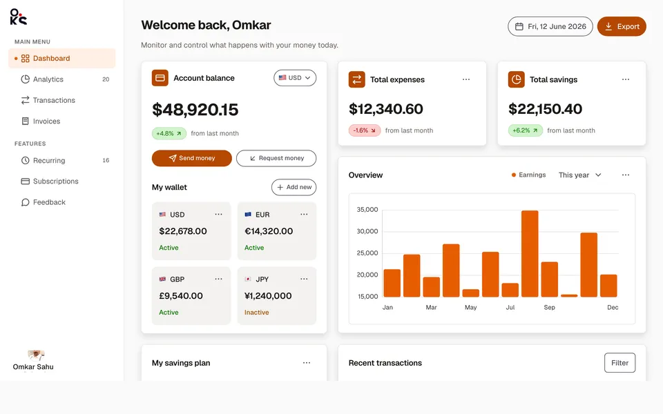
Analytics dashboardApp screens
A full fintech app screen — collapsible sidebar, header search, wallet cards, an earnings chart, savings goals, and a transactions table.
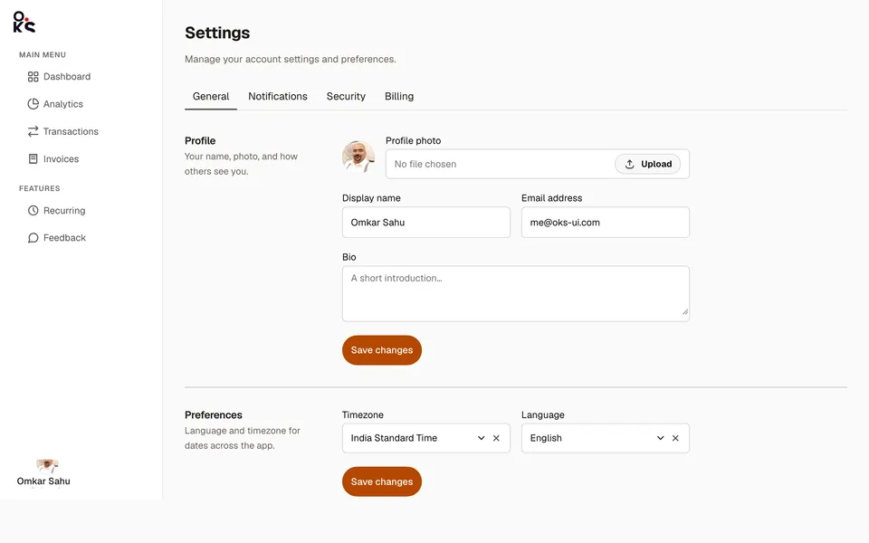
Settings panelApp screens
A real settings screen — top tabs, two-column sections, and a sortable, selectable billing history table.
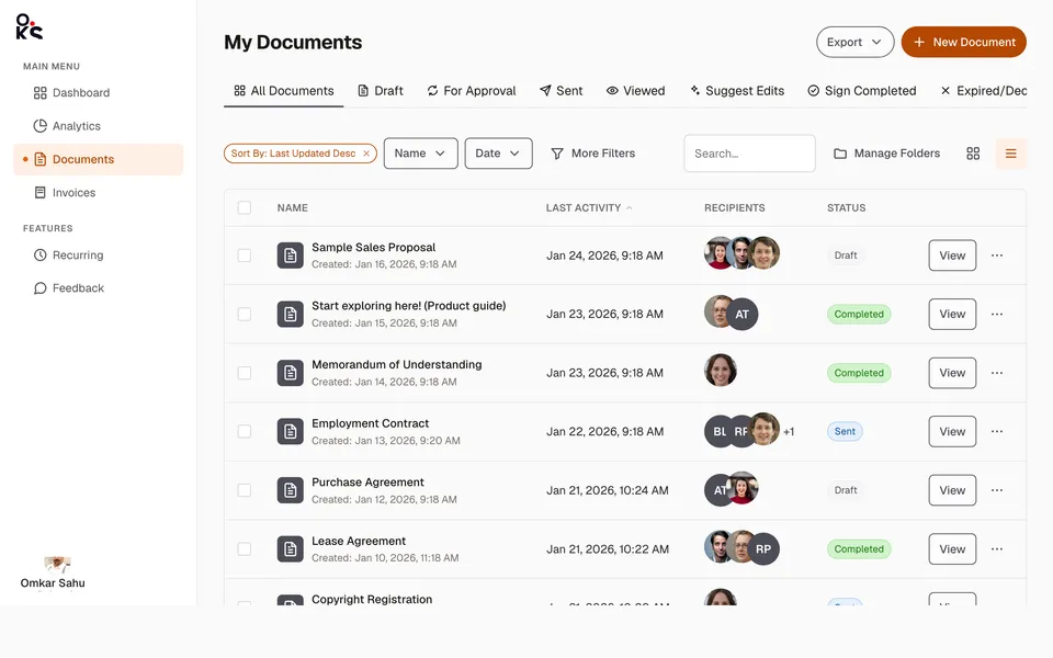
Data table viewApp screens
A full documents list screen — status Tabs, a filter toolbar, and a sortable, selectable Table with real recipient avatars.